Today, web presence is more important than ever – Franchises know this fact, too. Here is our very own 10 best franchise company websites, design-wise.

They need to transmit the right message to the site visitors so that their online marketing campaigns will not go in vain.
I have visited franchise companies website a lot, and to tell you the truth, many of them are sub-par and poorly design. Fortunately, most top franchises, especially global franchises, know that web presence is important and the right design and content transmitting the right message can attract and convert better and more.
The following is Franchise Note’s top picks on the most well-designed franchise company websites, in term of presentation: layout, colour scheme, branding, attractiveness, design efficiency and design effectiveness.
Top 10 franchise company websites designs
10. Ben and Jerry’s: Fun
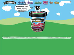
Ben and Jerry‘s not only produces fun and delicious ice creams, but also establish a fun-looking company website.
The layout is simple, and the homepage is mainly telling us the story what Ben and Jerry’s ice creams are made of. Unfortunately, the animation is not interactive.
9. McDonald’s: Conservative and bold
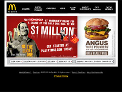
As one of the best global franchises, McDonald’s website looks rather simple, yet informative.
Although the white-on-black color scheme looks great, I’m not sure whether their site is enhancing McDonald’s branding – The logo, mascot and location design don’t use black as the main colour.
8. KFC: Conservative and branding
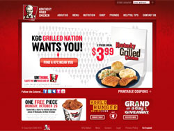
KFC did a great job revamping their last website. Although the layout and design are rather conservative, the use of KFC’s red as the main color theme is a highly effective branding move.
I actually fave the slight-grunge of the background design.
7. Pizza Hut: Branding
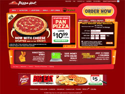
Pizza Hut‘s site brings similar story to KFC’s in #6, with one additional perk: The design elements are very well-designed, in such a way that it is in harmony with the Pizza Hut logo.
The use of red as color theme is, too, great for branding. The animation of the pizza-related products’ presentation is well-done and right-on-purpose.
6. Ace Hardware: Classic
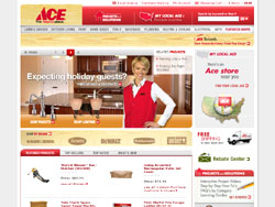
I always love Ace Hardware‘s official website design. The tools product page and the classic hardwood design elements throughout the site always reminding us of what Ace Hardware is all about.
Not necessarily retro, the classic look shouts “trust” and “professional.”
5. RE/MAX: Professional

The site showcases what RE/MAX is all about: One of the best real estate franchises. Although the design is flashy, the modern, glassy look is truly portraying professionalism.
The real estate listings and search forms are well-crafted and well-laid out. The hot air balloon serves as a strong branding image or RE/MAX.
4. Taco Bell: Urban and Ethnic
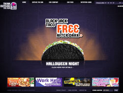
Taco Bell‘s official site shouts urban and ethnic – The dark colour theme with a light ethnic design background portrays what Taco Bell is all about quite well.
The product introduction on the homepage is very well done.
3. Burger King: Clean and interactive
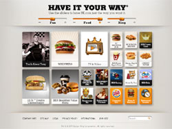
The last time I visited BK‘s website, it has a minimalistic look with white spaces all around. This time, they use interactive elements that can cater a wide array of customers, arranged well in a clean layout.
Use the sliders above to suggest you what kind of info you might needed, a neat feature keeping site visitors on-site for some time.
2. Sonic Drive In Restaurant: Family
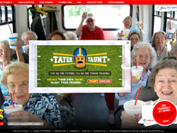
I’m about to put Sonic Drive In‘s in the #1 spot, but I finally decided to rank the official website second.
I particularly keen on the customer photos on the background – You can scroll through a series of photos from the bottom-right navigation. Looking at the photos, Sonic Drive In is ‘family’-oriented, indeed.
1. Dairy Queen: Fun and interactive
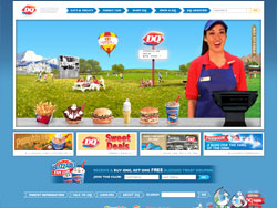
I am a fan of Dairy Queen‘s products and their official website, too. I decided to rank their website first due to the high-level of interactivity.
You can visit the ‘virtual land’ of DQ, where you can watch old ads, browse the menu, etc. in an outdoor-like virtual environment.
Great branding, great community building and great marketing campaigns.
So, there you go. If you have any franchise company official websites to recommend, please do so by commenting on this article.
Ivan Widjaya
The best franchise company website design